Calibra.
Digital

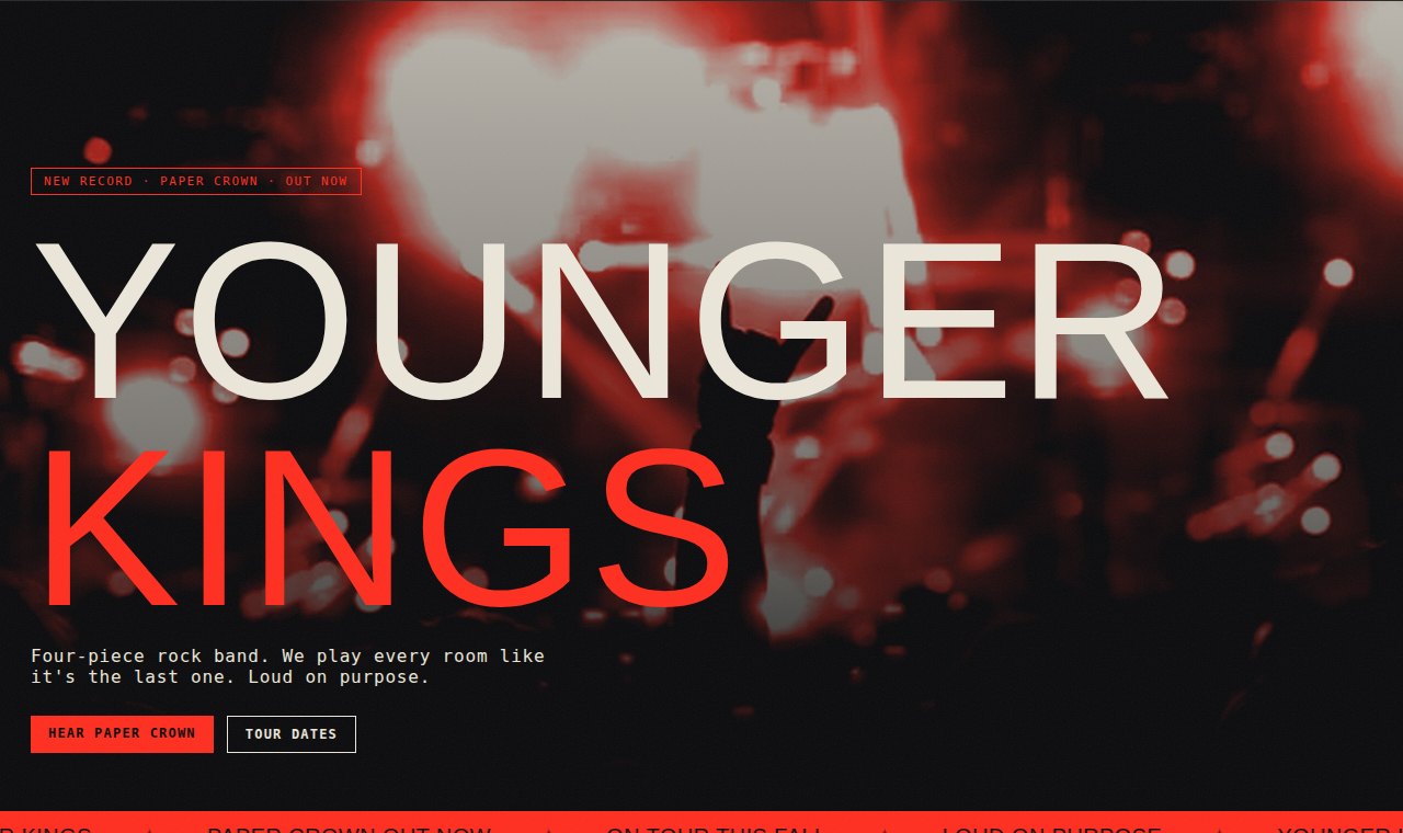
A concept for a four-piece rock band, Younger Kings — editorial bones with the energy turned all the way up, so the site hits the way the band does.
A band lives or dies on energy, and most band sites kill it — a template, a stock hero, the tour dates buried three taps down. The music's loud; the website whispers.
Younger Kings needed a site that felt like standing in the room when the count-in hits — without tipping into noise.
I kept the editorial discipline — a real grid, a strict type system — then spent every ounce of energy where it counts: oversized poster type, one hot red doing all the shouting, live photography graded into the palette, and motion that never sits still.
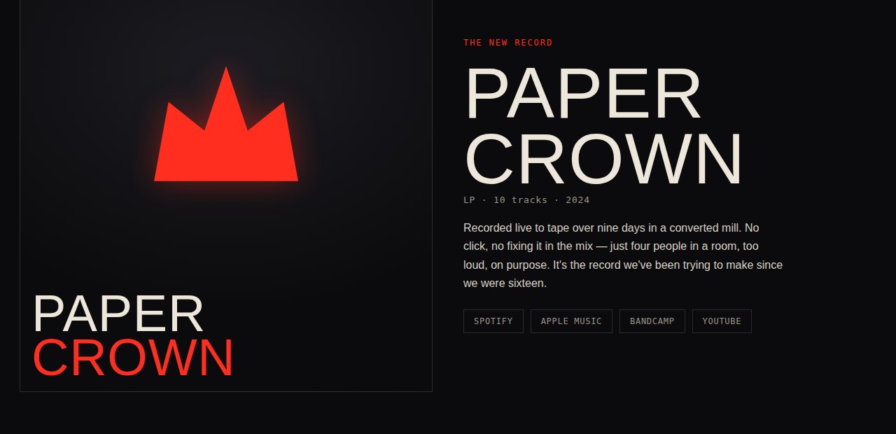
The album art, the vinyl, the tour patch — all drawn in code, so it loads fast and stays sharp. Loud, but designed.
See the Live Concept →Oversized display type and a single hot accent carry the volume — not one stock graphic in sight.
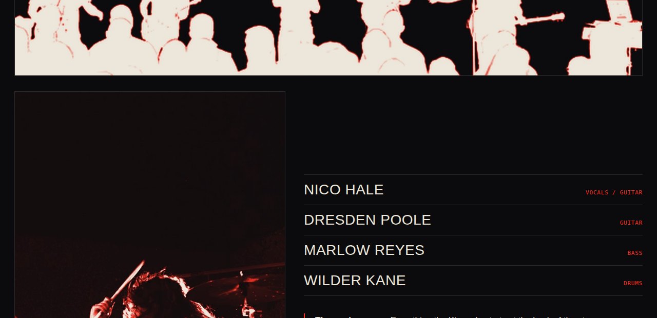
Real live shots, duotoned into the band's palette so the room and the design read as one thing.
Covers, vinyl, and merch built in code — no heavy image payload, no compromise.
If your brand has more energy than your website lets on, that's a fixable problem. Tell me about it.
Start a Project