Calibra.
Digital

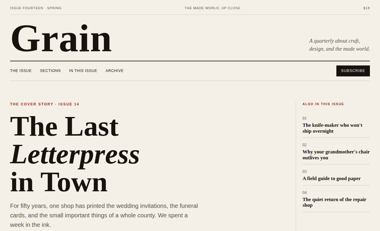
A concept for a quarterly print magazine, Grain — a light, editorial world where type does the work and every headline earns its space.
A magazine's website usually betrays the print — flattened into a blog feed, all the craft of the page lost. The thing that made the magazine worth holding disappears online.
Grain needed a site that read like the issue itself: considered, typographic, and unafraid of a light background and a lot of white space.
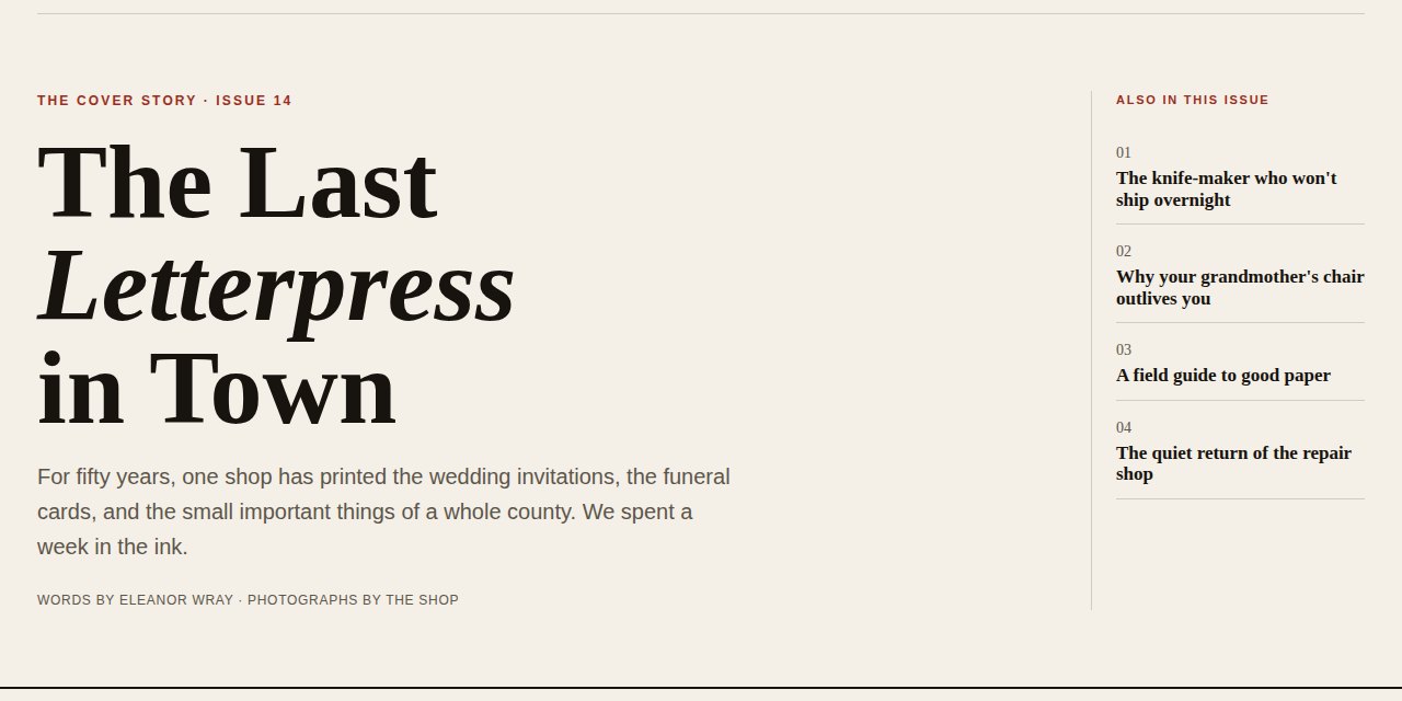
I built it like a real issue: a typographic cover story, coverlines down the margin, departments, and an article grid where a high-contrast serif carries the whole thing.
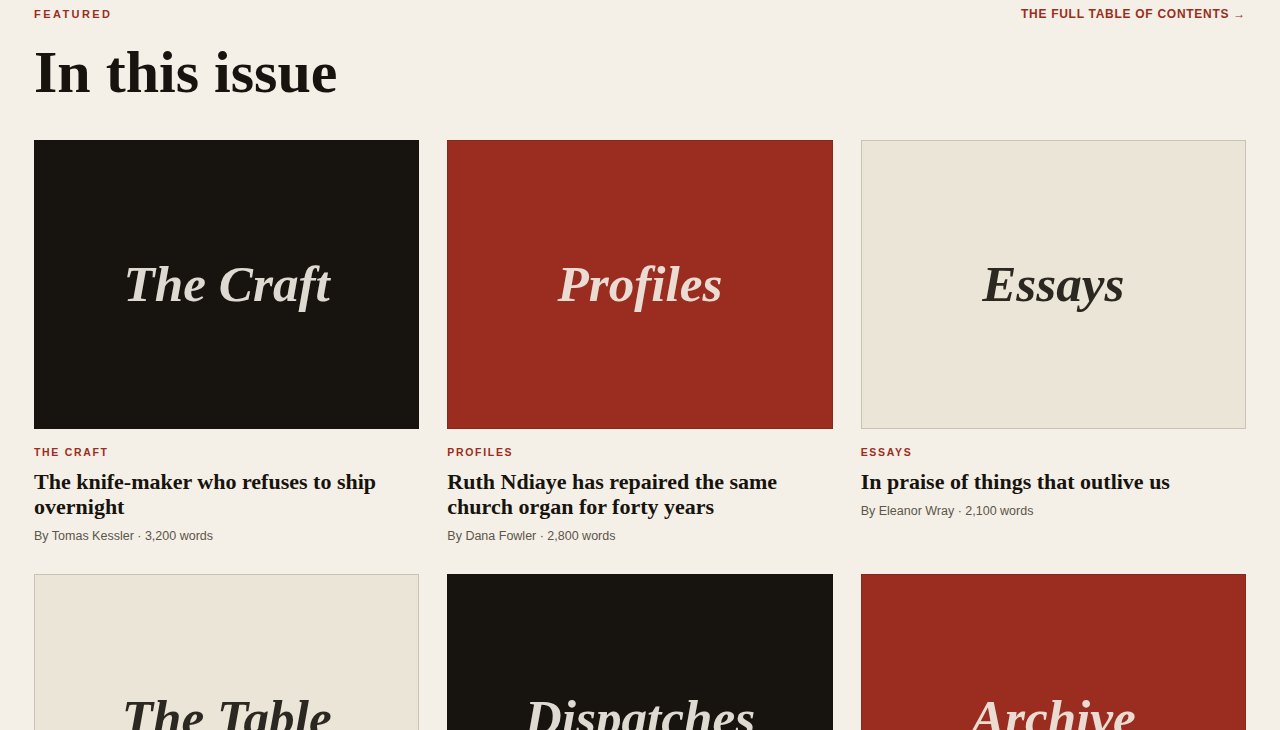
Light paper instead of the usual dark drama, so it reads like print. Every 'photo' is a designed tile — proof that on the right site, type alone can feel rich.
See the Live Concept →A high-contrast serif carries the design — no photography required.
A light, editorial world that respects white space and the long read.
Cover, departments, and a real table of contents — structured like the magazine it is.
If your content deserves better than a template blog, it can have it. Tell me about it.
Start a Project