Calibra.
Digital


A concept for a grassroots nonprofit — Community First Alliance — built to make the mission unmistakable and the path to give impossible to miss.
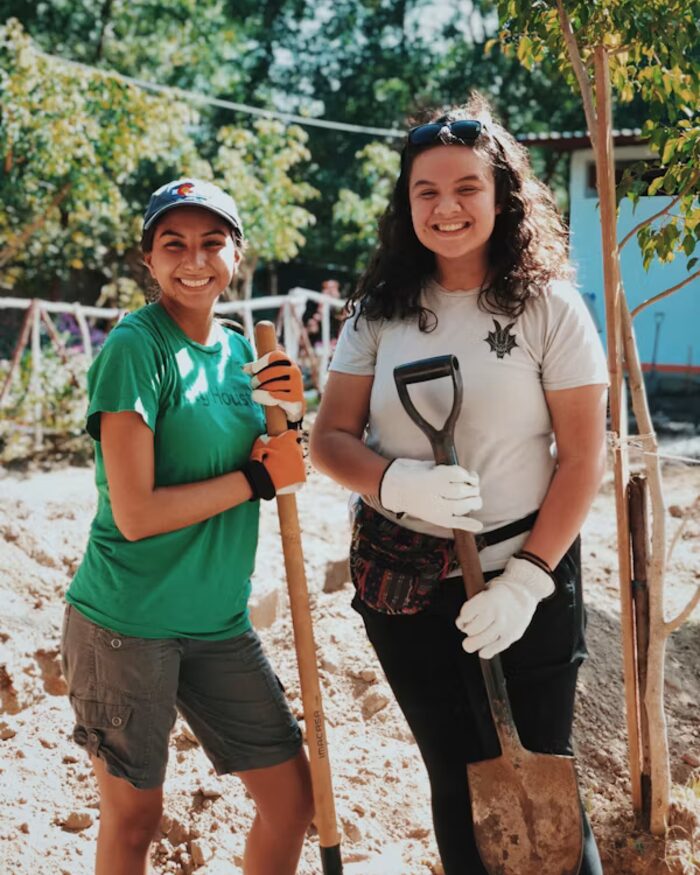
A donor decides in the first ten seconds or not at all. They arrive wanting two questions answered — what does this do, and can I trust it — and a cluttered site answers neither. Most nonprofit sites bury the mission under events and jargon, with the way to give three clicks deep.
Community First Alliance had a real mission and a stretched-thin team, but a presence that hid both. The brief was to make the work obvious and the way to help unmissable — without asking the staff to become web experts.

I led with the mission in plain language, showed the work honestly, and kept a clear way to give within reach of every page. Three programs, stated simply. One number that proves the impact. Nothing between a visitor and the decision to help.
Underneath, I built something a small staff can actually keep current — updates without wrestling the tools — and a giving path that reads the same on a phone at a bus stop as on a laptop at a desk.
See the Live Concept →What they do and who it serves, stated plainly and up front, so a first-time visitor understands it before they scroll.
The path to donate or volunteer is never more than a glance away — no hunting, no friction, no second-guessing.
Built for a small team to keep current between everything else they carry, so the site stays alive without becoming a burden.
If your cause deserves to be understood at a glance, I'd like to help. Tell me about the work and what you need the site to do.
Start a Project