Calibra.
Digital

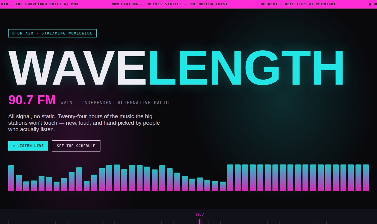
A concept for an independent alternative station, WVLN Wavelength 90.7 — neon, motion, and a real program grid, with not a single photo doing the work.
Radio is invisible by nature — it's sound, not pictures — so most station sites fall back on stock photos of headphones and go quiet. The energy of the signal never makes it to the screen.
WVLN needed a site that felt like the broadcast itself: alive, always moving, and easy to actually tune into.
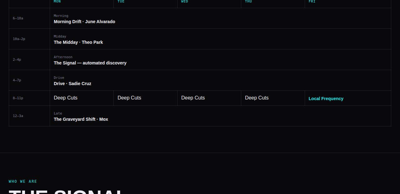
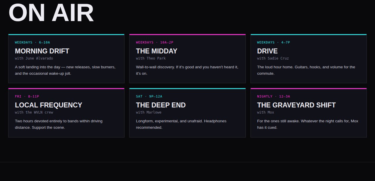
I built the whole thing out of motion and type — an animated EQ spectrum, a scrolling now-playing ticker, a real tuner dial, and a proper program grid — in a neon palette that could only be radio.
No photography at all, and nothing feels missing. The medium is sound; the design just makes it visible.
See the Live Concept →An animated spectrum and a live ticker make an invisible thing feel on-air.
The schedule listeners actually want, laid out like a broadcast guide — not buried.
Built entirely from type, color, and motion. Fast, distinctive, unmistakable.
Some brands don't need photography to stand out — they need a system. Tell me about yours.
Start a Project