
Curated, not catalog
For businesses selling online — a boutique with a growing storefront, a maker with a small catalog, a shop that wants its taste to survive the move to a screen. Editorial merchandising over generic grid-and-filter templates.
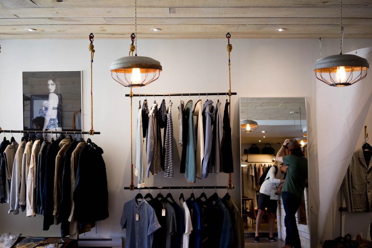

"The store should feel like an extension of the shelf, not a bolt-on cart."— how every store project starts
Most off-the-shelf store platforms solve the mechanics of selling — cart, checkout, inventory — and then hand you a generic grid to drop products into. That grid is where the thing that made your shop worth visiting quietly disappears: the point of view, the curation, the taste.
We build the merchandising layer around your actual products and how you want them presented — a few well-framed categories instead of an endless scroll — while the buying mechanics underneath stay simple, fast, and dependable.
Products presented with the same taste and pacing as the physical store, not a flat inventory grid.
Buying online should be the easiest part of the visit — no friction between browsing and paying.
Online and in-person feel like the same business, whichever way someone chooses to buy.


A curated modern goods shop built to sell in person and online, seamlessly — read the case study
Tell me what you make or sell and how people currently buy it.
Send a Note